Showing posts with label Linda Byrne. Show all posts

Tuesday, November 25, 2014

Official Launch of Pigs On Parade

It's official, Pigs on Parade have officially been launched by the Jack & Jill Children's Foundation! I'm still busy working away on my pig and the deadline is drawing near. My pig will be collected this Saturday 29th November. Right now i am finishing off details of the pigs features and i will then have to varnish it, so i have a busy few days ahead but i am delighted to be part of such a great art initiative. 
Pigs-Images


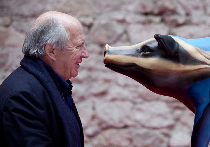
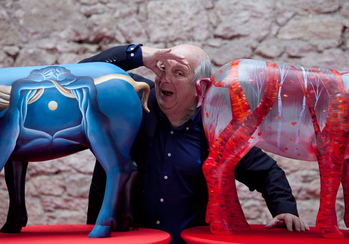
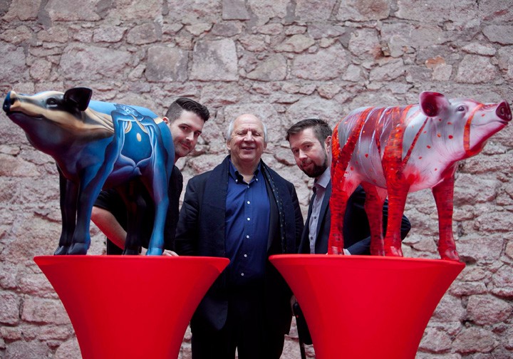
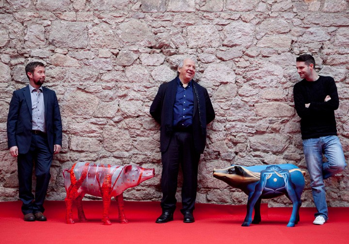
The Jack & Jill Children's Foundation have officially launched what will be the biggest Pigs On Parade and public arts initiative to take place in Dublin in January 2015!  Irish artists Vincent Devine and Willie Redmond, both from Co. Offaly, unveiled the first two completed Pigs at Art Source in the RDS.
Vincent Devine’s pig design called Relativity is based, according to the artist, on abstract realism drawn from his subconscious called ‘Relativity’ and represent the mother and father of the child; representing the Jack & Jill Foundation, surrounding and draping the parents in a comforting and supportive way.
Willie Redmond’s pig design is inspired from the bogland landscape where he grew up in Offaly aptly named ‘Hog in a Bog, can’t see the tree little pig for the woods’. The Birch Trees are prevalent in the piece which conveys depth and water through bogpools and floating leaves; both dramatic and distinctive pieces incorporating their style on this unique canvas.

Similarly to the Big Egg Hunt, Pigs on Parade is a public arts initiative organised by the Jack & Jill Foundation that will see 100 unique pieces of art in the form of painted and decorated life-size fiberglass Pigs designed by leading artists and designers going on display in public accessible areas around Dublin City in January 2015. All Pigs are available to be sponsored or purchased in the lead up to the parade.
“We are very excited to launch Pigs on Parade both from a fundraising perspective and as it creates unique pieces of art for the public to view. The monies raised from this campaign will support home nursing care for our 300 sick children nationwide. On behalf of the families we support, thanks to Oman, UPS, Q102, and Kia Motors for the support to date for the campaign and also to all the 100 artists on board and to David Southern for spearheading the whole project for Jack & Jill.” – Jonathan Irwin – CEO Jack & Jill
In January 2015 Jack & Jill will invite people to find the fantastically designed ‘Pigs on Parade’ that have been created by the talented artists from around the country, with a chance to win lots of fantastic prizes. All the Pigs will then be auctioned off online and will culminate in a live auction in March 2015, all in aid of Jack & Jill.

Thursday, November 13, 2014

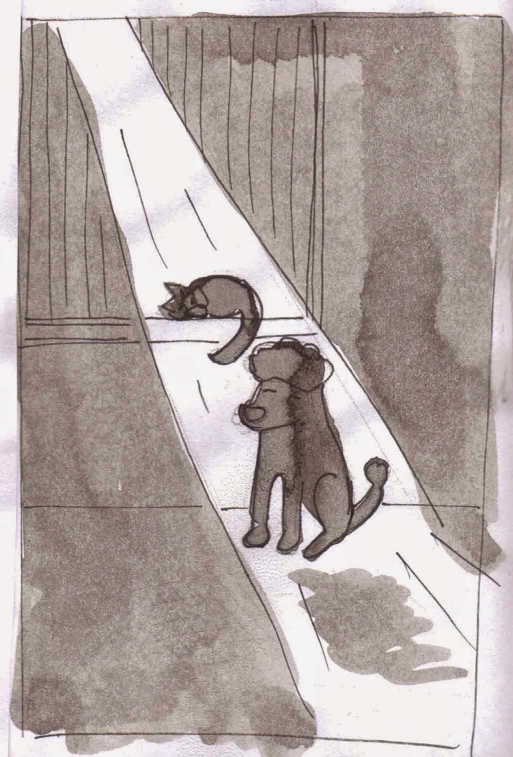
Watching The World Go By : Dry Point Printing

During the week I have been experiementing with "Dry Point" printing on my illustrations. I havent done any dry point in a number of years so it was good to get back into it. Shadowing and atmosphere were the aspects that i was hoping to achieve. Here is some information about the Dry Point printing process.

Development work : Composition
This image of achieved  by drawing onto a perspex plate of plastic, using a scribe tool. The harder you work onto the perspex the deeper the line and the darker the line will be once printed. Also the closer the lines are scribed together, the more ink in that area and the deeper the tone. Different line qualities are achieved by presser applied to the  scribe, line direction and various techniques. Other techniques examples could be cross hatching, dots or circles, each will have its own print quality. Remember that when you print your work, it will be the reverse image of what is scribed on the plate.


Development Work : Atmosphere / Tone

Once your plate is scribed, it is then inked up using oil based etching ink. The plate is then rubbed down using fabric known as "Scrim" and then acid free tissue. Meanwhile watercolour paper should have been soaking in preparation, this the then blotted down, to remove any excess water. The plate is then rested on the printing press bed while the paper is placed on top of it, then they are sent through the press.
 
 
TA Dah....


Close up
 
Once your image has been printed you can see if you would like to alter the piece , you can work back into the plate to achieve deeper lines, although when using perspex for this method, it has a limited printing ability. Which means that line quality and clarity will alter after it has been printed a number of times. This method of printed can also be done using a copper plate which would be more durable. This is merely the tip of the ice-berg in what can be created as various colours and interacting plates open up so many possibilites.


Tuesday, November 11, 2014

"The Elves And The Shoemaker" Character Development

Over the past two weeks i have been designing characters as part of the Picture Book course i am attending. We have to select a fairytale story and re-design a main character. The story i picked was "The Elves And The Shoemaker," i loved that story when i was growing up, the thoughts of Elves which came to help in the middle of the night was very believable to me!! I decided to re-design the main Elf character. I played around with many idea's of what she could look like and what style would be used to draw her. For inspiration i looked towards the amazing Disney artist Mary Blair, the brains behind the design of "It's A Small World" and the feature film's of "Peter Pan" and "Alice In Wonderland."

Here are some of the character development sketches I've created, (sorry the photo quality isn't that great) :


Monday, October 20, 2014

Must Love Dogs


A watercolour illustration which i did earlier this year. The inital drawing is done with my trusted Pentel Pocketbrush, possibly the greatest pen ever invented if you love the fluid nature of ink! ....oohh but dont bring it with you on a plane, they have been known to leak with the cabin pressure!


Sunday, October 19, 2014

The Artist Notebook Project

The Kildare Artist Notebook Project is ran by the Kildare Arts Office and it invites artists at all stages of their development to participate in the project. Artists are invited to fill a notebook in a creative way. Each notebook is then donated to Kildare County Council Arts Service to become part of a permanent touring collection. I am extremely excited to be part of this project, i am one of those artists who cares their notebook with them at all times, and i have always been that way since my early days in art college! So a chance to glimpse at other artists' notebook's always interests me because sometimes i feel that you learn more about an artist from their development work or rough idea's than their finished pieces.

Since i've had to hand over my notebook to the Arts Office, i decided i would document my notebook, I then made the photographs into a stop motion flipbook animation.


The offical opening of the Artist Notebook Project took place on Saturday 18th October by Dr Maebh O' Regan, in the ever impressive "Riverbank Arts Centre" in Newbridge. The exhibition is also part of the Kildare Literary Festival 2014. Check out the Kildare Artist Notebook Project website for more information on the Artists and where the touring exhibition will be next
http://www.kildarenotebookproject.com/


Tuesday, October 14, 2014

Spring Is On The Horizon


"After Winter Comes Spring" is a chalk board animation which i created a number of years ago. It reflects the economic crisis the country was experiencing of the past number of years. As budget day 2015 is upon us there is rumours that some taxes may be reversed, could we be getting over the hard times? Is spring on the horizon?

Thursday, October 9, 2014

On the Pigs Back!


Today i received great news that the design i had submitted for the charity event "Pig's on Parade" has been selected! Wahoo! The event is to raise money for the "Jack and Jill" foundation. Artists are selected to design a fibreglass pig, the pigs are then displayed around Dublin for a period of time then they will be auctioned off to raise money for the foundation. I can't reveal what my design will be (under strict orders) but i will be updating my blog on my progress. Now all i have to do is await the arrival of my lil pig :)


Tuesday, September 30, 2014

Artist in School Residency 2013: "Penny And The Big Top"


Over the course of several months I had been collaborating with twenty-eight pupils in Scoil Choca Naofa in a stop motion animation group project funded by the Kildare Arts Office. The project involved all students in a third and fourth class mix, and seen pupils learn the art of stop motion animation. Pupils explored the theme of “A Trip To The Circus.” They took inspiration from Alice Maher, Kara Walker and Shaun The Sheep! Learning about all elements of animation, from scriptwriting, storyboarding, character design, set design to final production shooting. Pupils collaborated their idea’s, stories, characters and imaginations to create one final stop motion animation production. The result of which was a seven minute short.


          The first phase was writing a group story and developing a script, from here each student was assigned a scene to sketch the storyboard, then they designed and made a character and a prop or set piece. The collaboration of each pupils work began in the next phase, when shooting began, taking reference from previous storyboards produced. Each pupil gained hands on experience of animating characters, adjusting lighting, managing sets and deciding on camera angles, alternatively referred to as “Lights, Camera, Action!!” Pupils also recorded narrating the script, known as a “voice over.”          Once all the production photography had been shot, I digitally combined the audio with the visual imagery, then added a musical soundtrack, with sound effects.


          A great hype was created around the school on the day “Penny And The Big Top” premiered for the first time pupils seen their hard work come to life. Each pupil got a certificate of participation and a DVD copy of the animation.


          During my time in Scoil Choca, I hope that I have made an impact on the pupils perception of art and it’s limitless possibilities. All pupils were alert, smart, imaginative and keen to learn. They enjoyed all activities and the school and class teachers were continually supportive. The skills they have learnt will last them much longer and they have experienced the power of collaboration, working as part of one team.
          The finished animation is viewable on the school website or is available for viewing in the school.
https://vimeo.com/85248709


Monday, May 27, 2013

"Beyond The Wild Garden"


The author of the very informative and quirky gardening blog "Beyond The Wild Garden", David Corrsacadden, commissioned me to create a watercolour header for the blog. The brief given to me was simple; make it freeflowing , classic yet keep the hand drawn feel and watercolour finish. While also creating a avatar illustration of David himself. Here is what i came up with.....

Beyond The Wild Garden Blog Header

David Corscadden: Beyond The Wild Garden
 David Corscadden: Beyond The Wild Garden

Check out David's blog here : http://beyondthewildgarden.wordpress.com

Tuesday, April 23, 2013

The Possibilities Are Endless


Delighted to get this in the post during the week! An illustration which i drew for the wedding of Deirdre Hughes & William Flood, has been used on their thank you cards to all the guests that shared their special day! Glad you liked it guys, looking good!!!


Wednesday, February 8, 2012

"Refigure" Exhibition


Refigure is a collaborative exhibition by nine final year students of Fine Art in Dublin Institute of Technology. Meaning ‘to figure again, or anew,’ the show is curated around the title theme, extending an invitation to the viewer to consider the importance of their own role in the artistic process. The works on display encompass a wide range of disciplines, varying from painting to sculpture, to video, to print and more, yet they are united by a common purpose, to refigure the audience’s perception in some way. Some pieces challenge the misconceptions surrounding social taboos, particularly mental illness, and aim to invoke new understanding and empathy from the viewer. Other works demand a more physical form of interaction from the viewer in order to be experienced, creating an awareness in the audience of their role through active participation. More passively engaging artworks provide contrast to this, presenting the articulated thoughts and memories of the artist for the viewer to contemplate from the context of their own perspective. Ultimately, Refigure aims to highlight the importance of the relationship between the artist and the viewer and draw attention to the refiguration that occurs to an artwork once the artist has inevitably renounced control
Refigure is part one of four of the ‘Mini-Exhibition’ project.


Sarah Murphy, Kat 1 of 3, Video Installation
My work is concerning the impact of emotional or psychological trauma, in particular the trauma of women, which includes domestic violence, rape, sexual assault,physical and verbal abuse. Following my own theory that all people have experienced trauma in their life, I want to force the viewer to empathise with the victim and remind them of emotional traumas, by reflecting the emotions of the victims onto the viewer. As part of my research I am conversing with women who have experienced emotional trauma in their lives and are willing to share their experience.I have invited the women to write their experience in their own words and send it to me. Through the medium of video, I use the information form these stories to make conceptual films to represent the trauma.

Sarah Murphy, Kat


Natalia Tysiak, Thoroughfare, Spot light projection on glicée print.

Natalia Tysiak’s current body of work has been inspired by the technologies ofmemory, particularly exploration of memory as oppositions of presence/absence and fiction/reality. Although artistic practice remained set within printmaking practice, Natalia applies multi-media methods to produce a finished image. Thoroughfare is a proposed view of a point in time, where the transition of reality into a memory occurs, where time is of ambiguous setting, tangible truth is displaced and becomes a memento. An intricate glimpse of co-existence of, both, presence and absence. Ephemeral in nature, challenges notion of remembrance, and suggests duality of time- time as shared moment (present), and time as individual memento(eternal). Collision of which, is described by intimacy, that promotes a dialogue on the inner perception of time of a memory. Light directed onto the print in secretive manner, is an exclusive-like possibility for the viewer to peek at the artist’s private experience of time.
Natalia Tysiak, Throughfare


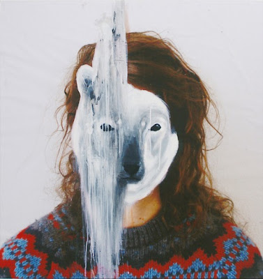
Linda Byrne, I pulled myself back together, but I fell apart again, Fabriano Paper
The serious issue of the perception of mental illness, in particular depression, is the focus of my work. The stigma which surrounds this medical illness is still prevalent in Irish society today. The personal torment and heavy burden of this disease on its sufferers is a serious cause for concern. According to the nation report “Suicide In Ireland,” one of out of every seven sufferers of depression will commit suicide,
accounting for 42% of all suicides in the country. Astonishingly suicide accounts for more deaths per year in Ireland than road traffic accidents, yet people know little about this or of the underlying disease which leads to suicide. Through my work, I hope to create understanding of depression, understanding for the viewer and understanding for the people who are unfamiliar with this illness. I believe that this stigma needs to be addressed; creating a dialogue through empathy may lift some of the perception surrounding this illness.

Linda Byrne, I Pulled Myself Togther But I Fell Apart Again

 
Claire McCluskey, The Place Where Different Places Meet, Installation (thread, nails, glue, light)
Claire McCluskey’s work currently observes the nature of autonomy and separateness, with the aim of drawing attention to the paradoxical nature of this state. Just as ‘no man is an island,’ nothing can exist without its context, therefore there is no such thing, really, as pure autonomy. This piece, constructed from thread, is composed of two sides, a right set and a left set of threads, that meet in the middle. Each side supports its opposite, creating a line of consecutive meeting points, creating a virtual “place” where the two sides meet. Without the threads on either side supporting those opposite, the whole construction would fall, or not exist at all. Created specifically for the Refigure exhibition, this piece aims to reflect the nature of the show, the connection between artist and audience; that art cannot be made without being observed, and vice versa. The exhibition itself is the place
where these opposite entities support each other.

Claire McCluskey, The Place Where Different Places Meet


 Doug Barrett, Information Pending, Acrylic on Wood
The interaction which takes place when the viewer is met with this work takes place in two separate forms. The first is visual and the second virtual. Technological communication has become intrinsic to human nature and this work demonstrates a reliance on technology to deconstruct basic information. Without the necessary technology such basic information, in this case, the news is restricted. Information and interpretation are being explored through this work but also the restrictions of particular information. The arrangement of colour plays with this notion; that information being received is then perceived through visual communication to appear as an American flag.

Doug Barrett, Information Pending

Eimear Marie, 1. Distorting, 2. Fading away, Glass paint on plates.
I use art and the gallery space as a platform for dealing with serious topic of mental illness, in particular eating disorders. Statistics show that in Ireland there are 400 new diagnoses annually, with approximately 80 people each year dying from illness either through organ failure, severe malnutrition, cardiac arrest, related suicide or other related complications. And these figures are thought to be a fraction of the actual figures. The reason for this is that it is thought that there are no reliable statistics on this illness. With many sufferers never diagnosed for fear of being shamed. You see there is a stigma attached to this illness in the present day Irish Society today. My hope is that when the viewer encounters the work based on the personal stories, and reads the personal stories accompanying the work, they refigure their perception of what eating disorders are and those affected by them. Using the personal stories of sufferers in hope that by displaying these, the viewer will be able to empathise and come to the realisation that living with an eating disorder is not a choice, not vanity but a serious disease, often developed as a result of a trauma. And that it is an illness that affects those from all different classes of society, all races, ages and both genders.

Eimear Marie, 1.Distorting, 2 Fading Away.


 Meilan Cheung, Dragon Among Flowers, Ink on Paper, 1.
The main themes of my artwork are dragon figures and floral patterns. I use Dragon not only because 2012 is the lunar year of the Dragon, it is a memory from my childhood. I remember my father who once painted a Chinese Dragon for my brother. The vivid memory of that painting still stays with me. The floral pattern of the “Peony” reminds me the prints on the curtains, bedding, pyjamas, and kitchen towels in my childhood home. In Chinese culture, “Peony” symbolizes “Fortune and Wealth”. That is why my mother used these patterns around the house often. The Dragon also represents the highest power. It has been known as the symbol of Imperial power for three thousand years in China. The Dragon is still known as the symbol of luck, prosperity, and auspiciousness since the fall of the imperial ruler in 1911. The works of Michael Lin’s repeated floral patterned wall installations has influenced me, as well as Lily van der Stokker’s three-dimensional wall paintings. In addition, Henri Matisse in his cut out shape world, he made his “The Fabric of Dream” in small-scale. They gave me the creative inspiration that I have now and hope to carry onto my future development goals.

Meilan Cheug, Dragon Amoung Flowers

Carmel Mannion, Touch It, Oil, water, plastic
Carmel Mannion’s work aims to engage the audience in a playful state of participation in order to demonstrate the necessity of the presence of the audience for the ongoing life of the artwork. Her works are open-ended creations, never reaching completion, but persisting in a constant state of refiguration by the audience. This piece explores the ever changing dynamic between oil and water/artist and audience; elements that can never be mixed yet remain in a state of interdependency as they are equally integral to the production of art.

Carmel Mannion, Touch It

Mason McMillen, Untitled (Behind the Work), Acrylic, charcoal, on canvas, mixed media
This piece attempts to act as a playful commentary of the relationship between visual and conceptual elements. By extending the work past the limits of the canvas, the work in its entirety uses the object as a façade, a distraction. The concealed section of the standing figure on the wall, hidden by the object, becomes an idea of visceral curiosity. The image of the back of a figure is closely associated with the front of the face especially that of the corresponding figure. However, what lies‘behind’ the presented façade, in relation to the viewer, exists in an obscured reality, paradoxically existing and not existing. In this sense, the viewer’s curiosity and assumption embody the work, justifying its humorous visual appearance. Those inquisitive enough to peek behind the canvas confirm this idea of curiosity, by breaking a certain taboo of direct physical interaction in painting.

Mason McMillen, Untitled (Behind The Work)
Publication author: Claire McClusky